Walk into any pharmacy, grocery store, or big-box retailer and the greeting card display will contain hundreds of options. They'll be colorful, varied, seasonally appropriate. Some will be funny. Some will be sentimental. Most of them will look, on the surface, like perfectly good cards.
Nearly all of them were created on a screen. A designer — often working from stock illustration libraries — assembled the image digitally. It was reviewed, approved, and sent to a commercial printer that produced tens of thousands of copies. From concept to shelf, no human hand touched the artwork.
A watercolor card begins differently. It begins as a blank sheet of paper on a studio table, a brush loaded with pigment, and an artist making decisions in real time that cannot be undone. This post is about what that difference produces — and why it matters more than it might seem.
What "Original Watercolor" Actually Means
The phrase "watercolor card" is used loosely in the greeting card industry. It can mean a card featuring an image that was painted in watercolor. It can also mean a card featuring a digital illustration that was designed to look like watercolor — soft edges, visible texture, the appearance of washes — but was created entirely on a tablet or computer screen.
These are not the same thing, and the difference is visible once you know what to look for.
Digital "watercolor-style" cards
Created in software like Procreate or Adobe Illustrator using brushes that simulate watercolor behavior. The result can be beautiful and is often technically impressive. But the colors are mathematically precise, the edges are controlled, and the texture is applied as a filter rather than emerging from the physical interaction of pigment, water, and paper. These cards can be reproduced in identical copies indefinitely.
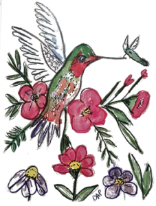
Original watercolor cards (like Hummingbird Whispers)
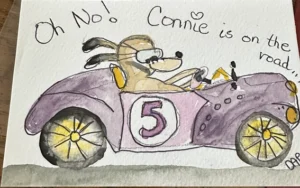
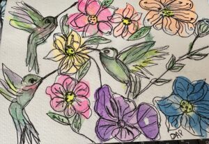
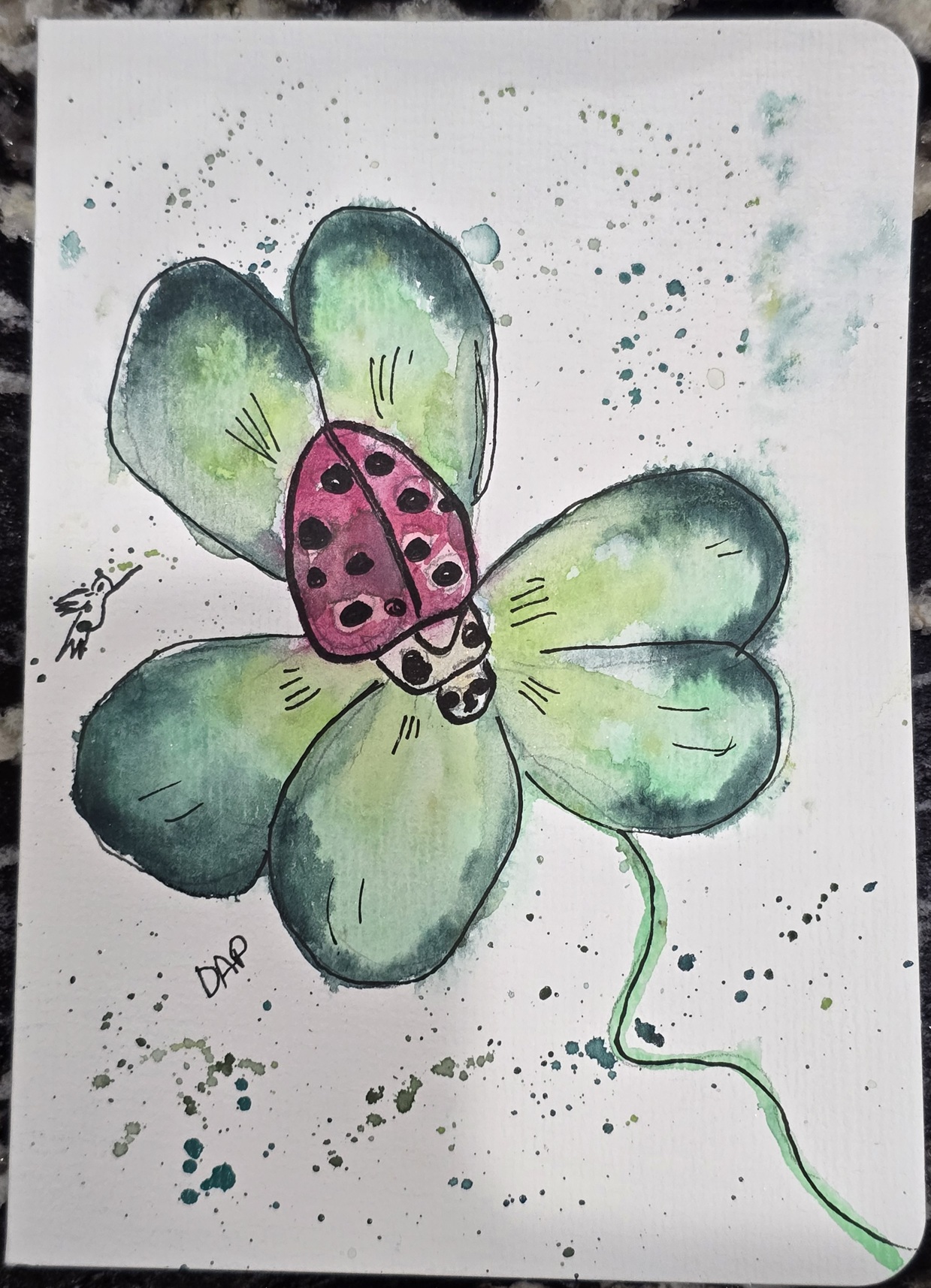
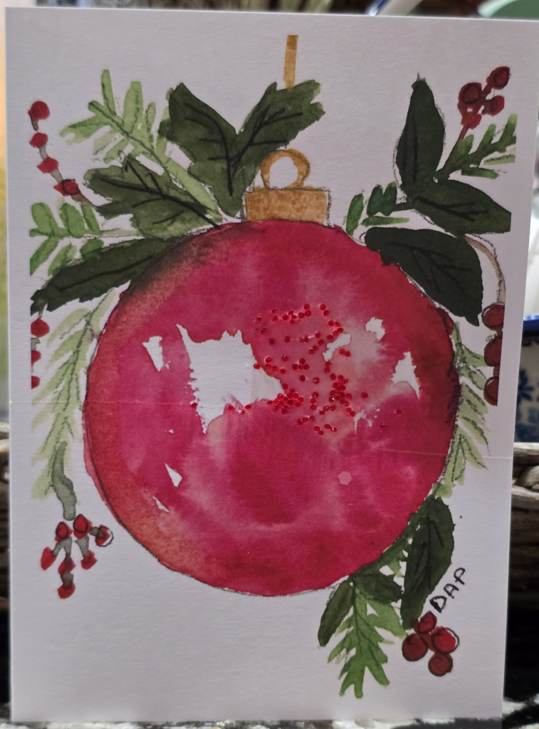
Created as physical paintings on watercolor paper using professional-grade pigments and brushes. The colors bloom and blend in ways that cannot be fully predicted or controlled. The edges soften where the paper was damp and sharpen where it was dry. The texture of the paper is embedded in the image. Each painting is unique — and the reproduction, however faithful, is a reproduction of something that actually happened, on a specific surface, on a specific day.
What You See — and What You Feel
The visual differences between an original watercolor card and a high-quality printed card are subtle but cumulative. They add up to a feeling that is difficult to articulate but immediately present when you hold one of each.
- Luminosity. Watercolor pigment is transparent — light passes through the layers and reflects off the white paper beneath, creating a glow that opaque or digital illustration cannot replicate.
- Edge variation. Where wet paint meets dry paper, the edge is crisp. Where wet meets wet, it blooms and softens. This variation is organic, unpredictable, and distinctive.
- Color complexity. A single watercolor wash contains multiple pigments that separate slightly as they dry, producing a depth of color that flat digital fills cannot match.
- The sense of a hand. Even in reproduction, the marks of a brush are present. The painting has directionality — you can feel the movement of the stroke, the places where the artist paused or accelerated.
Most people who receive an original watercolor card cannot name these qualities. But they register them. There is something in a watercolor reproduction that reads as warmer, more human, more considered than its digital equivalent. The science of this is partly optical and partly psychological: we respond to evidence of human effort at a level that predates our capacity to analyze it.
Why It Matters for a Greeting Card Specifically
A greeting card is a vessel for a message — but it is also, itself, a message. Before a word is read, the card communicates something about the person who chose it. A card that was clearly selected from a mass-produced display says something. A card that is visibly a piece of original art says something different.
This is particularly true in moments of emotional significance — illness, grief, celebration, the quiet impulse to tell someone they matter. In these moments, the quality of the card you choose is not a trivial detail. It's part of the message. A hand-painted card says: I looked for something worthy of this moment. I found it. Here it is.
The Reproduction Question
One of the most common questions about Hummingbird Whispers cards is whether they are "prints" — and what that means for their value as a gift.
Yes, they are reproductions of original paintings. Debra does not hand-paint every individual card. What she does is paint every original design — and those originals are then reproduced with the specific goal of preserving as much of the painting's visual character as possible: its luminosity, its edge quality, its color complexity.
The original painting exists. It was made by a specific person, on a specific day, using physical materials that responded to her touch in real time. The card you hold is a faithful reproduction of that event. That provenance is real, and it is present in the image.
Compare this to a digitally illustrated card, where no original exists — only a file. The card you hold is not a reproduction of something made by hand. It is the primary output of a process that never touched the physical world until the moment of printing.
What This Means When You're Choosing a Card
If you're choosing a card for a significant occasion — get well, sympathy, anniversary, a moment that calls for something more than adequate — the origin of the image matters. Not because original watercolor is objectively superior to digital illustration in every context, but because for moments that carry emotional weight, the evidence of human craft in the card you choose amplifies the message written inside it.
Debra's Hummingbird card and the full Animals collection are made with exactly this in mind. Each design begins as a painting. The DAP signature on the back confirms it. And 10% of every purchase supports the mission behind the cards — which you can read more about at Cards That Give Back.
To see the full process behind each painting — from first sketch through final watercolor layer — visit the Watercolor Art Process guide. And to understand more about what makes a card worth sending in the first place, read the complete guide to meaningful card-giving.
WRITTEN BY
Debra
- Artist, educator, and founder of Hummingbird Whispers. Debra paints original watercolor cards as acts of intention, each one made to be shared.
Greeting Card Ideas
Guides for every occasion
Debra's Art Studio
Behind the watercolor process.
Gratitude & Giving
Why every card gives back
ORIGINAL WATERCOLOR CARDS” — 10px, Jost 500, uppercase, letter-spacing 3px, color #d4b483
Send something that carries meaning.
Hand-painted by Debra. 10% of every purchase supports mindfulness & gratitude initiatives.